ShopDreamUp AI ArtDreamUp

Deviation Actions


Suggested Deviants


Suggested Collections


You Might Like…


Featured in Groups

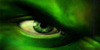
femalegirlgrangerhermionehulkmarvelsheshehulktftransformtransformationwomanhulkoutfemalemusclehermionegrangermusclegirlmusclegrowthmusclewomanfemalemusclegrowthmuscularfemalemuscularwomanhermionegrangerfanartshehulktransformationshehulkmarvelhermionegrangerharrypottershehulkouthermionefanartshehulkfanart
Description
Here's a new commission I've been working on for RBL-M1A2Tanker featuring Hermione Granger from the Harry Potter series. Based on a story written by himself (Sensational Hermione - Sample4) Hermione runs into the girl's bathroom as she feels an inhuman rage overtake her. Her clothes start to feel tight on her body as she feels a strange sensation overtaking her.
Next::origin()/pre00/19b9/th/pre/i/2018/113/3/3/commission__hermione_gets_mad_part_2_by_eduartboudewijn-dc9jwb0.jpg)
Next:
Image size
1076x1417px 894.25 KB
© 2018 - 2024 EduartBoudewijn
Comments14
Join the community to add your comment. Already a deviant? Log In
Hello from ProjectComment !
It's cool to know the backstory. (Smile)") I had simply thought perhaps she was experiencing some polyjuice potion effects and was about to turn in a rather muscley kitty! Knowing that she's turning into a she-hulk more or less certain clears that up!
I had simply thought perhaps she was experiencing some polyjuice potion effects and was about to turn in a rather muscley kitty! Knowing that she's turning into a she-hulk more or less certain clears that up!
I think you are at a point right now in your artist career (judging by this and the other picture of the horse) where you have a decent grasp on drawing structures and anatomy, but it's the shadowing and making the subject feel apart of the background that is the next big thing to tackle. The first and foremost advice and critique I can give you on your artist journey is to avoid using purely darker colors of the base color to shade, and to begin considering 2 sources of lighting (the bounce lighting in specific) to make it feel like the character is alive and apart of the background.
To give an example, the light in the picture as drawn is coming mostly in front of her and up top, and partially to her side. We get this impression from her basic shadow on the ground; however, there should be a bounce light coming off of those green bathroom stalls from behind her, as they are a bit reflective, and would be bouncing back a very faded version of that green onto her backside, rather than that backside of her being burned to a blackened outline.
And, if I'm not mistaken, I believe you're using a soft brush to burn shapes, which gives everything a pillowed shape. You can achieve better, harder definitions if you were to use a hard brush and pick good colors to do the shading with. Because she looks muscled, but those muscles would look so much better if they had a sharper edge to them. If you look at illustrations of the hulk, the shadowed lines along his muscles are typically very stiff, and mostly hard lines are used for the outlines save for the softer hints at belly muscles. Even tiny flat lines that together work to create a curve work better than a curve, if you know what I am saying.
I hope this helps!
It's cool to know the backstory.
I think you are at a point right now in your artist career (judging by this and the other picture of the horse) where you have a decent grasp on drawing structures and anatomy, but it's the shadowing and making the subject feel apart of the background that is the next big thing to tackle. The first and foremost advice and critique I can give you on your artist journey is to avoid using purely darker colors of the base color to shade, and to begin considering 2 sources of lighting (the bounce lighting in specific) to make it feel like the character is alive and apart of the background.
To give an example, the light in the picture as drawn is coming mostly in front of her and up top, and partially to her side. We get this impression from her basic shadow on the ground; however, there should be a bounce light coming off of those green bathroom stalls from behind her, as they are a bit reflective, and would be bouncing back a very faded version of that green onto her backside, rather than that backside of her being burned to a blackened outline.
And, if I'm not mistaken, I believe you're using a soft brush to burn shapes, which gives everything a pillowed shape. You can achieve better, harder definitions if you were to use a hard brush and pick good colors to do the shading with. Because she looks muscled, but those muscles would look so much better if they had a sharper edge to them. If you look at illustrations of the hulk, the shadowed lines along his muscles are typically very stiff, and mostly hard lines are used for the outlines save for the softer hints at belly muscles. Even tiny flat lines that together work to create a curve work better than a curve, if you know what I am saying.
I hope this helps!